Introduction
Barclays, one of the world's leading financial institutions, recognised the need to revolutionize how practitioners perceive and engage with the Barclays Brand. The Barclays Brand Site, which supports over 6 million colleagues worldwide, had remained unchanged since 2014.
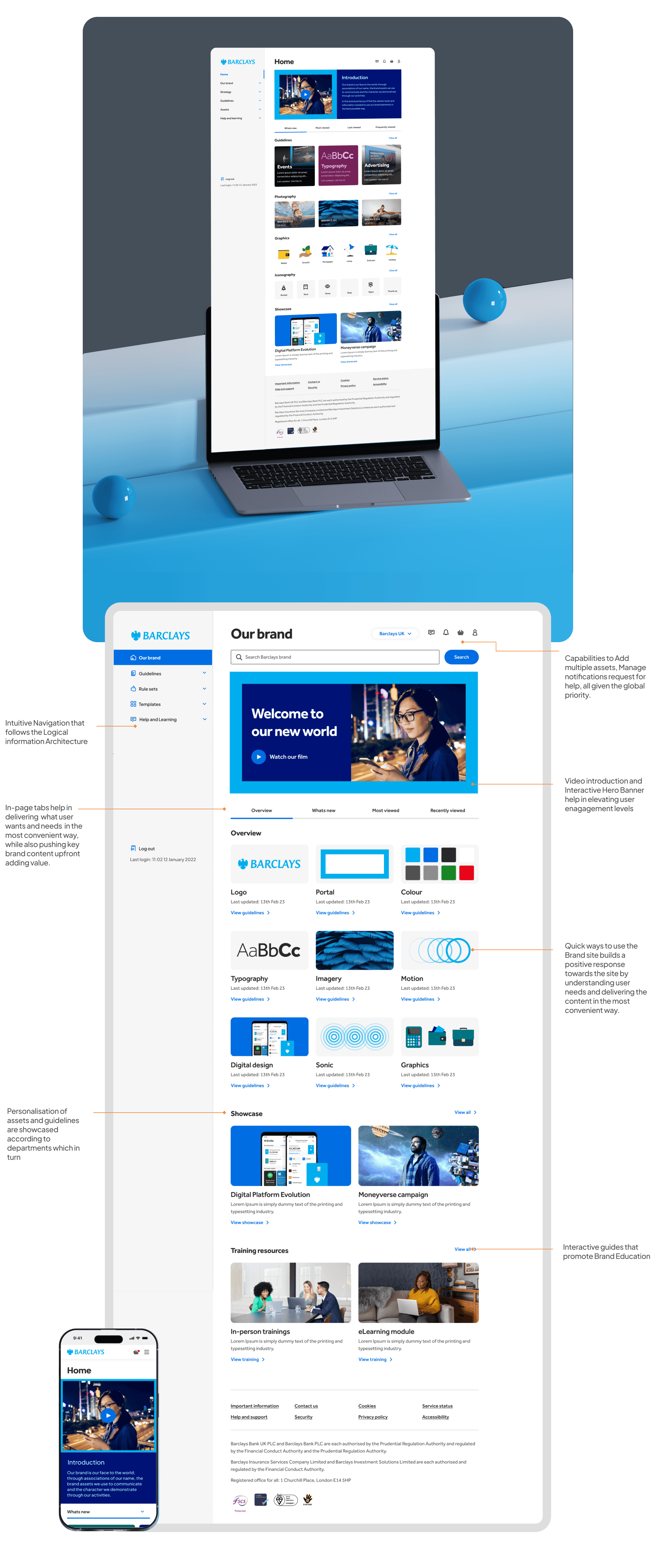
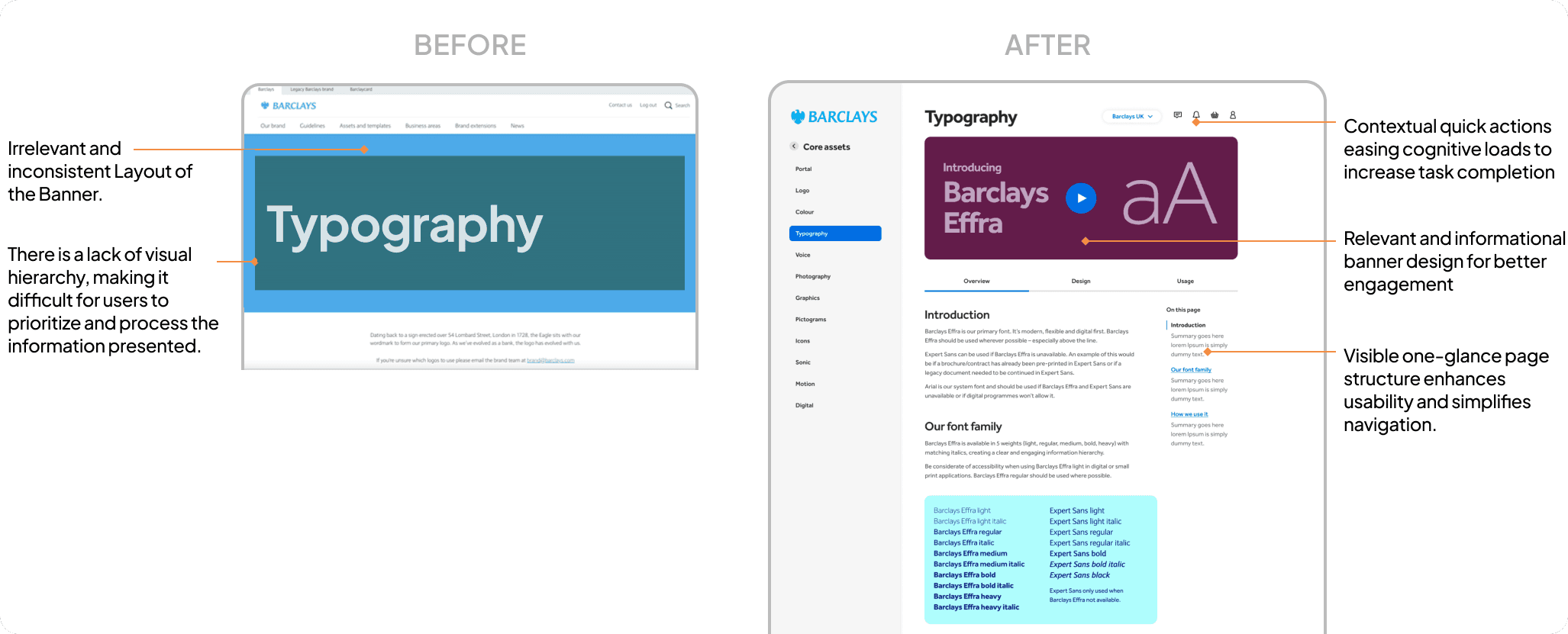
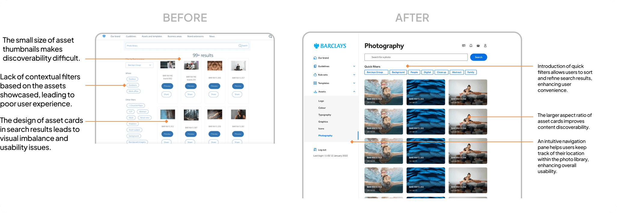
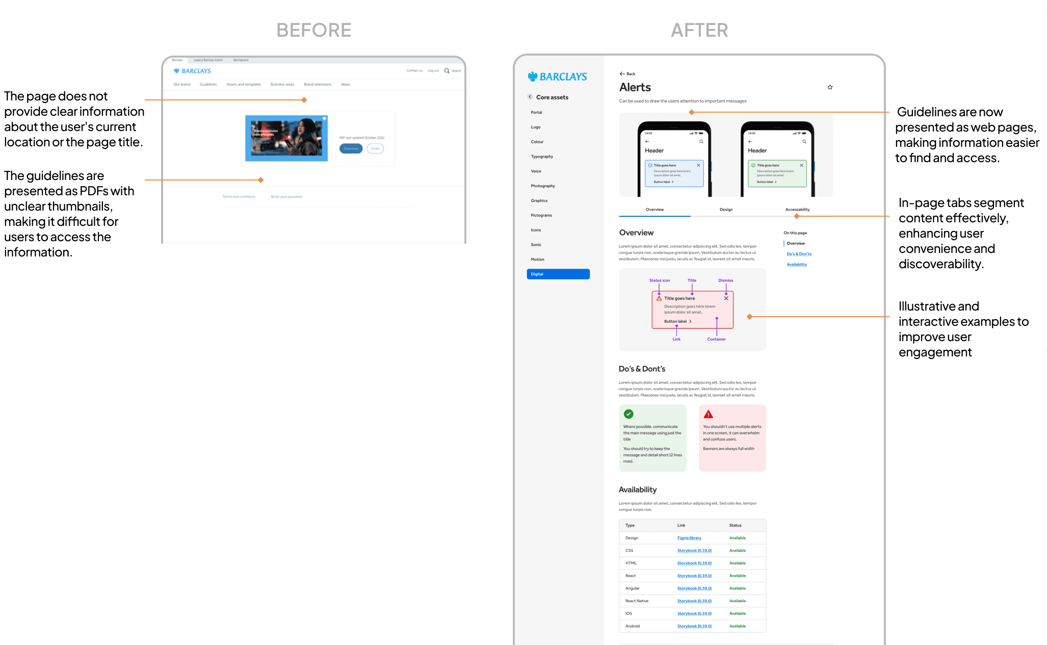
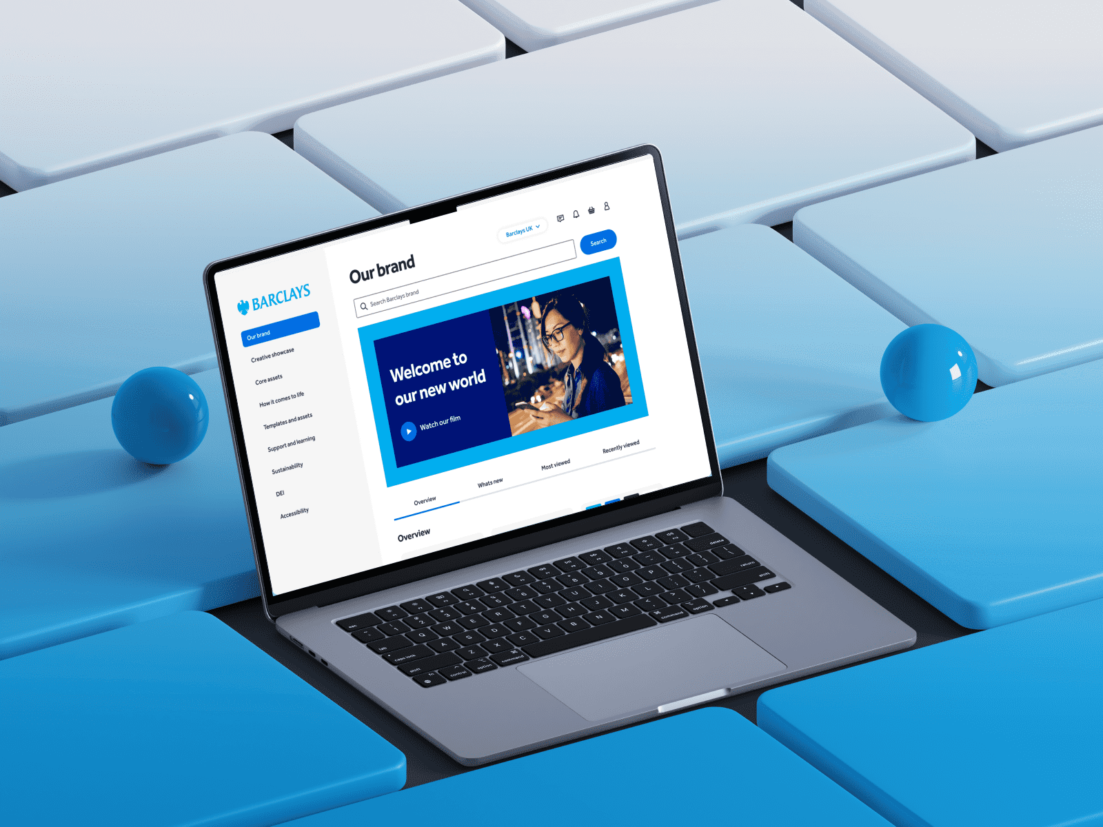
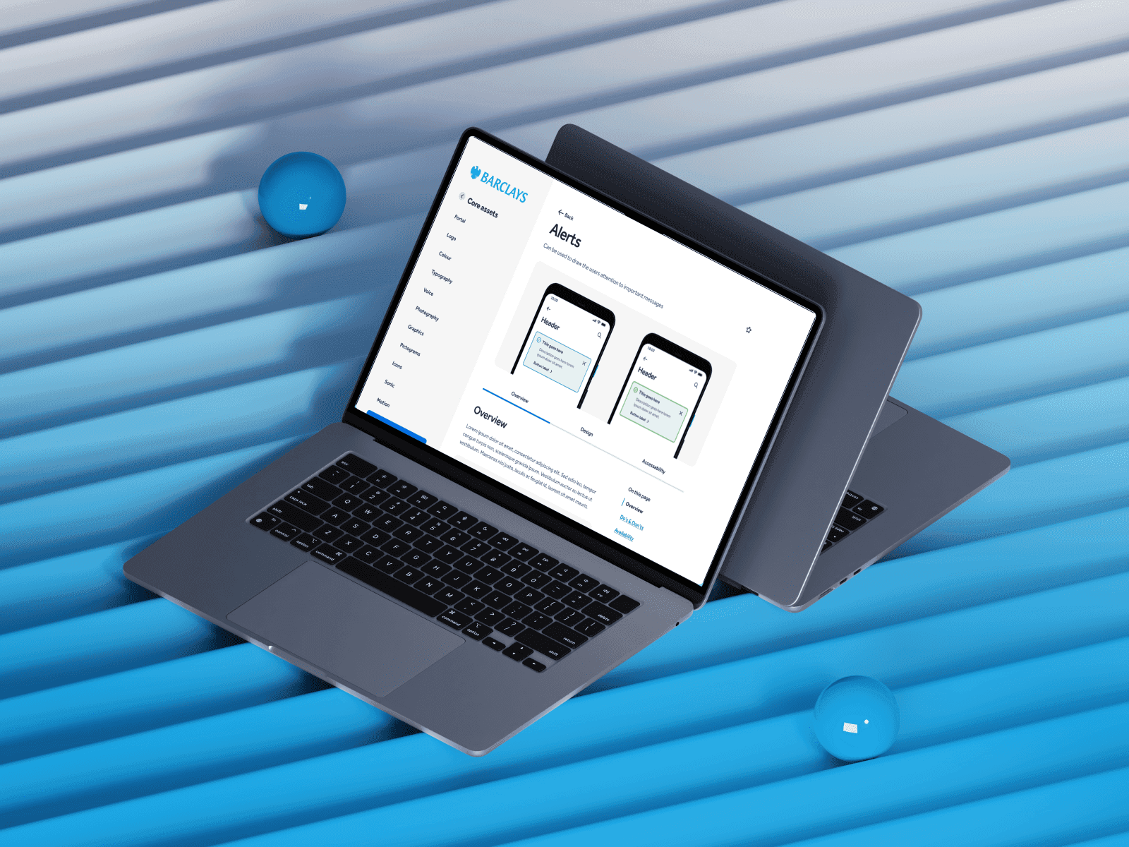
In this project, we did a complete overhaul of the site's functionality, revamped the user experience and fundamentally changed its engagement model. Previously serving as a mere repository for brand PDFs, our solution transformed Brand Site into an interactive tool for discovering, learning, trying, and using the Barclays Brand, both now and in the future.
This was one of the largest projects at Barclays since 2021.
My Role
I'm the lead product designer for this project.
I collaborated with product designers (Kay James, Chinmay K, Disha S) throughout this project.
The Problem

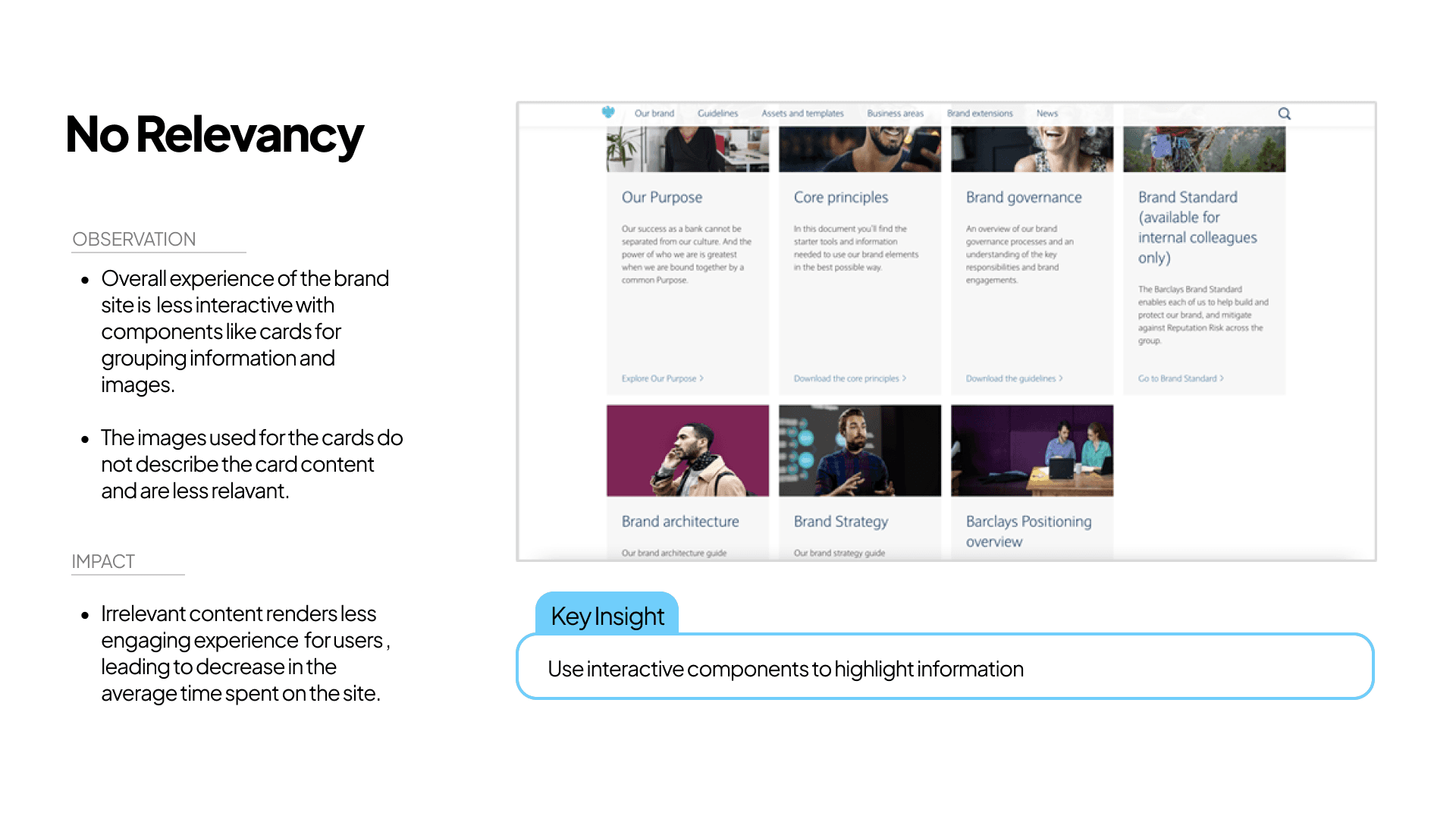
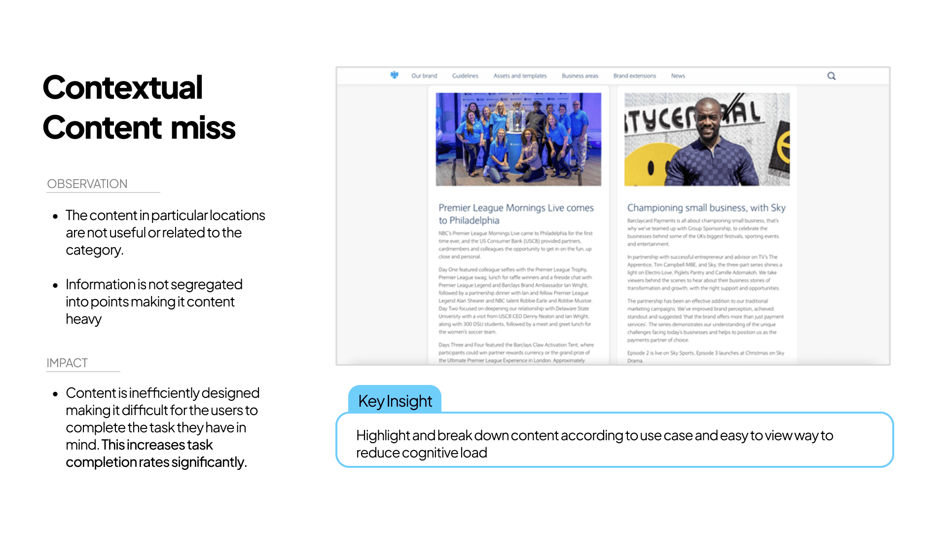
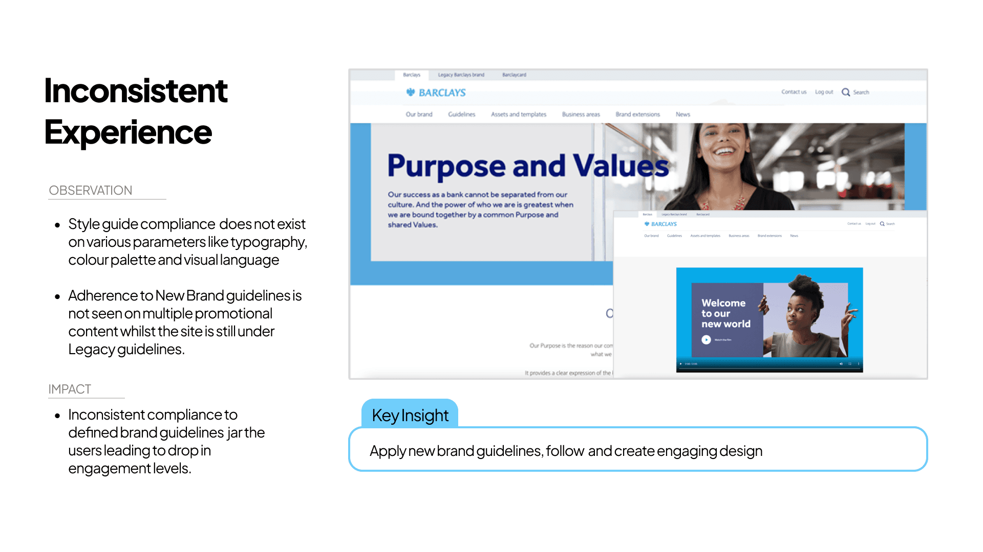
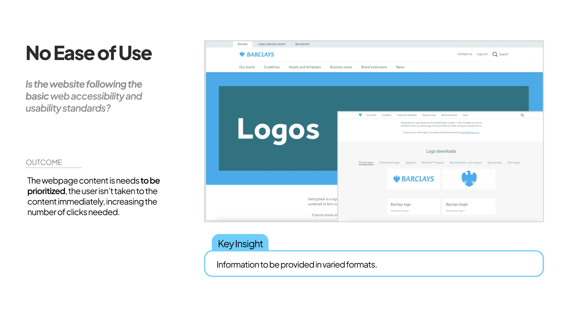
Since 2014, Brand Site experience has not been changed. Here are the key problems with the core experience.


Defining the Problem

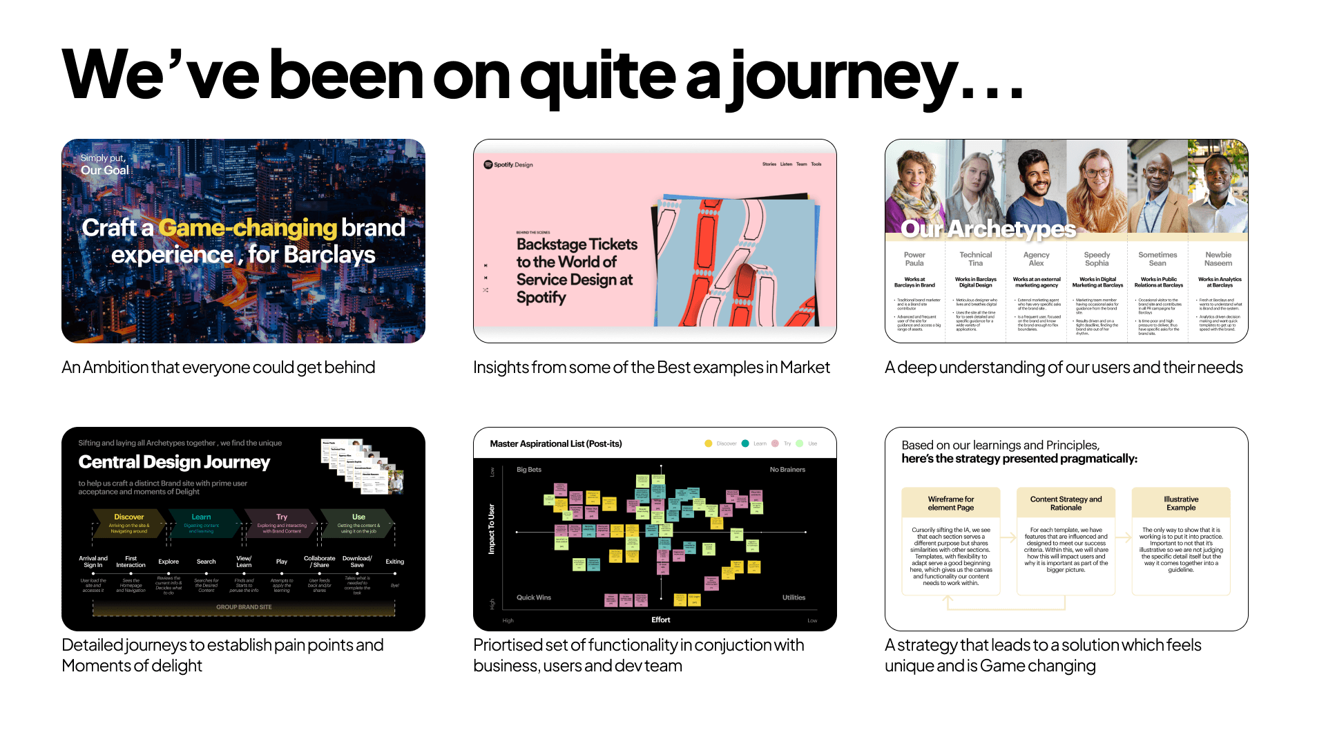
Simply put, Our Goal was to…
To transform this vision into a real-life implementation, we devised a unique but practical approach.
Our Approach

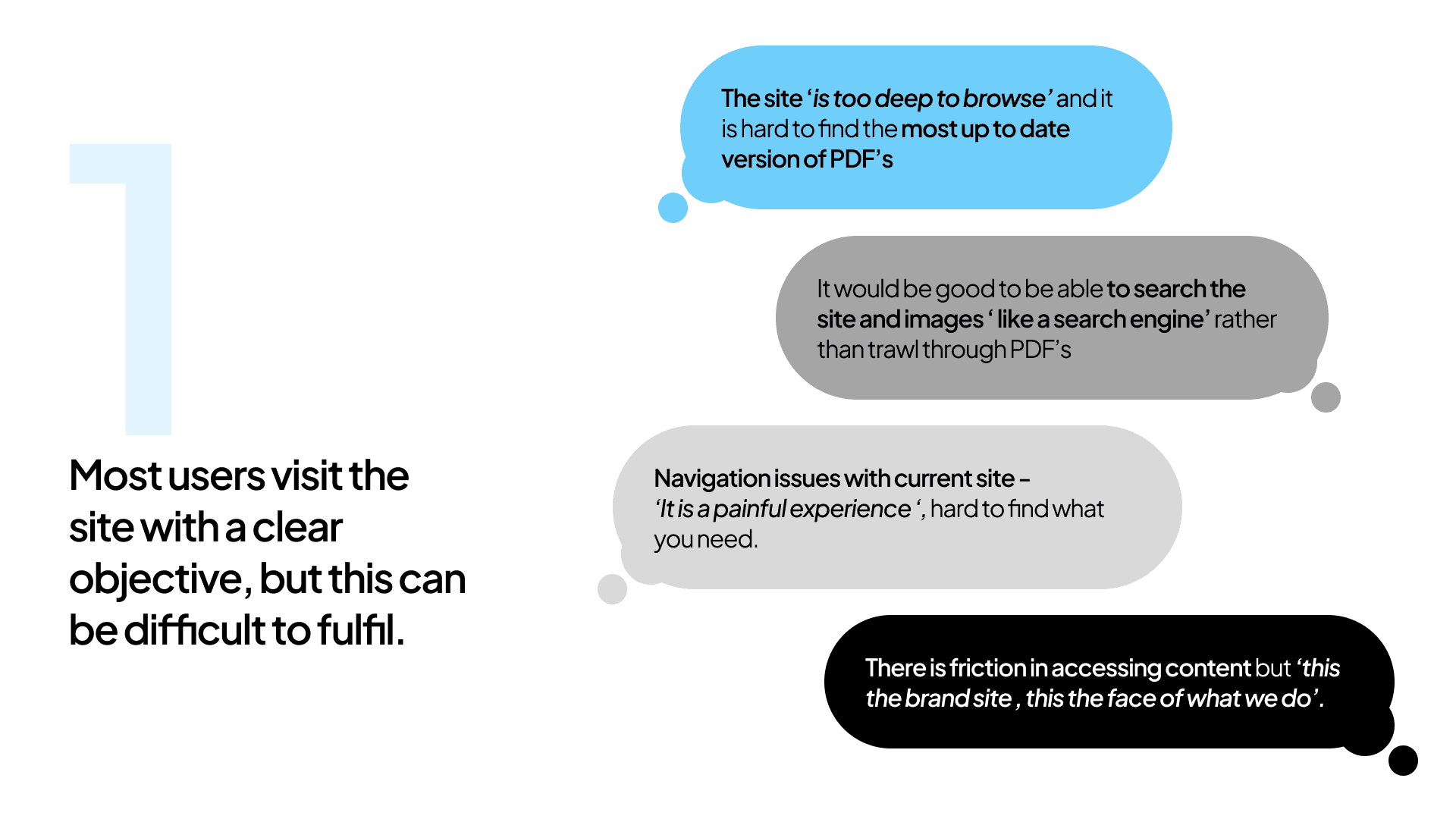
With all this set, we kickoff with user Interviews to understand…

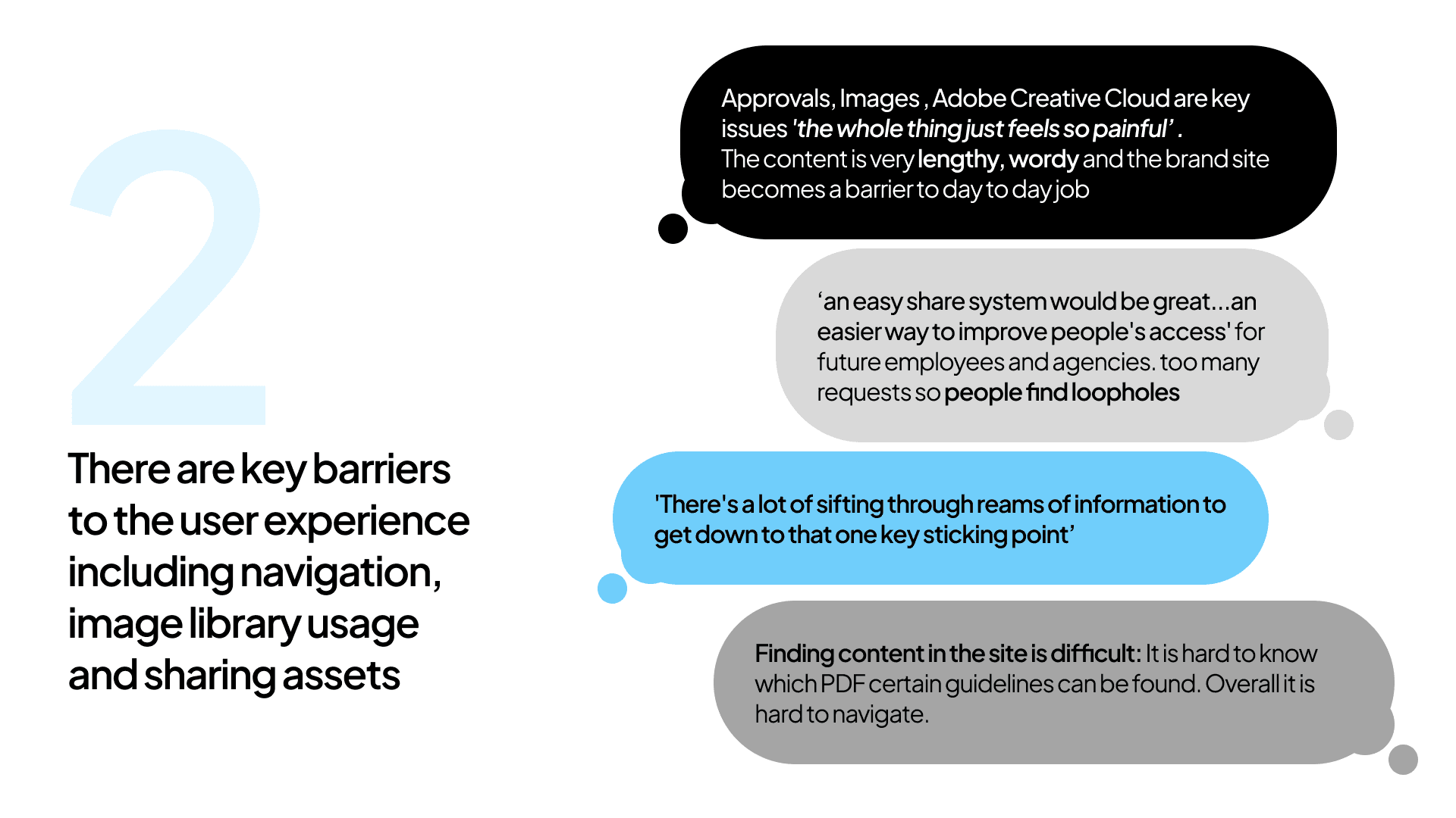
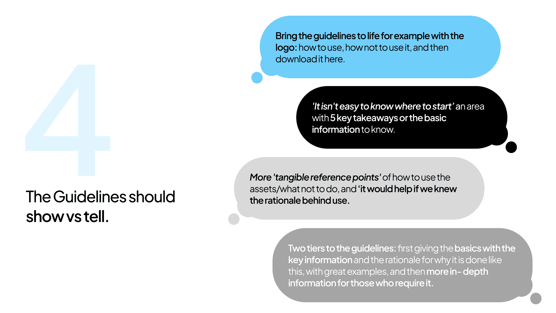
Since 2016, the Brand site experience has not been changed. In order to gather comprehensive insights, we conducted extensive interviews with stakeholders from various positions at Barclays. These sessions provided valuable perspectives on user aspirations, pain points, and areas where things could be done better. Below are the key findings from these interviews.


Our Users
Before we started designing, we deep dive into existing behavioral and usage data of our users to understand them better. We focused on identifying what is the job that our colleagues use the product for.
And based off these interviews and workshops, we segmented our users into 6 Archetypes and mapped them to their respective jobs-to-be-done.

A deeper dive into our users to understand their role, objectives, pains and ideas.

Finding Clues
Sifting through and combining all archetypes, clues began to emerge. These clues revealed the essential pathways defining how different user personas interact with the site to achieve their goals.
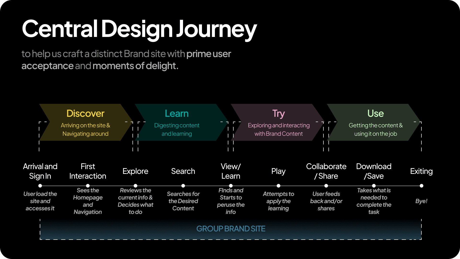
In hindsight, we realized these pathways were actually key user journeys, mapping out the steps, interactions, and touchpoints our archetypes encountered while using the product.
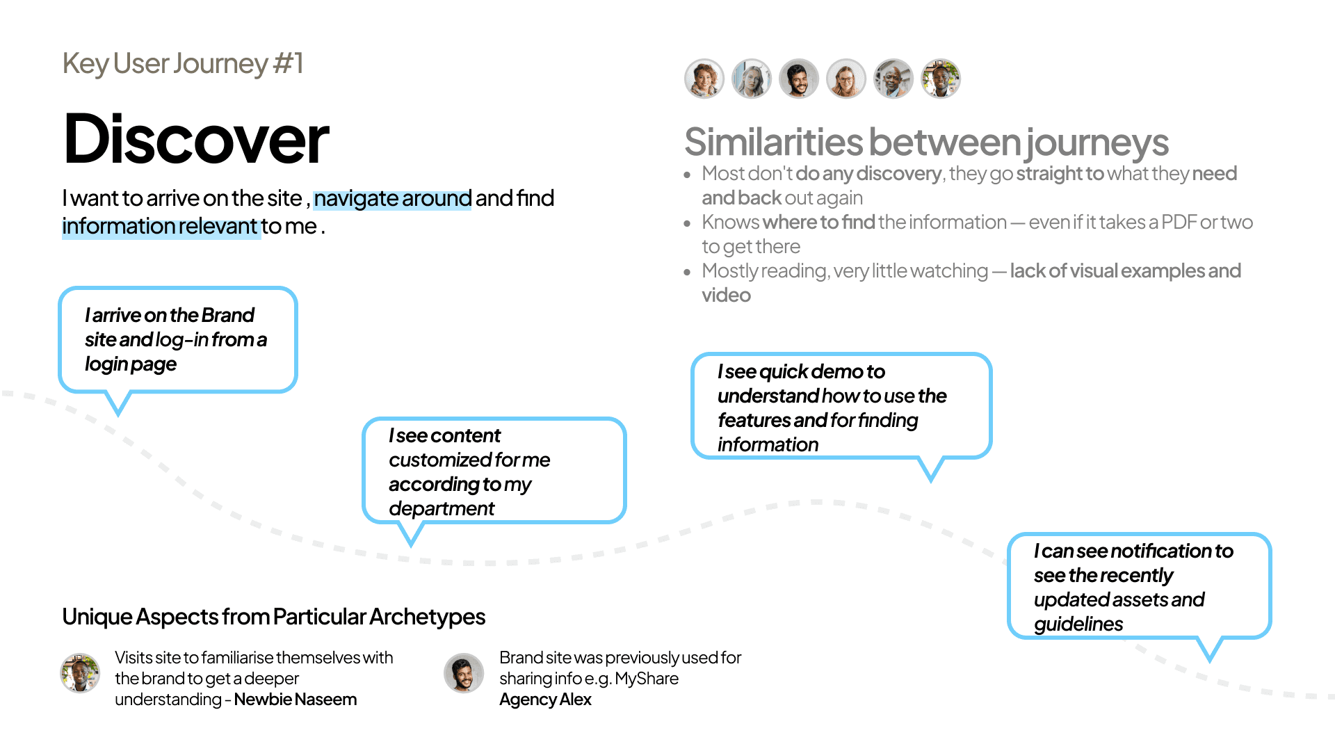
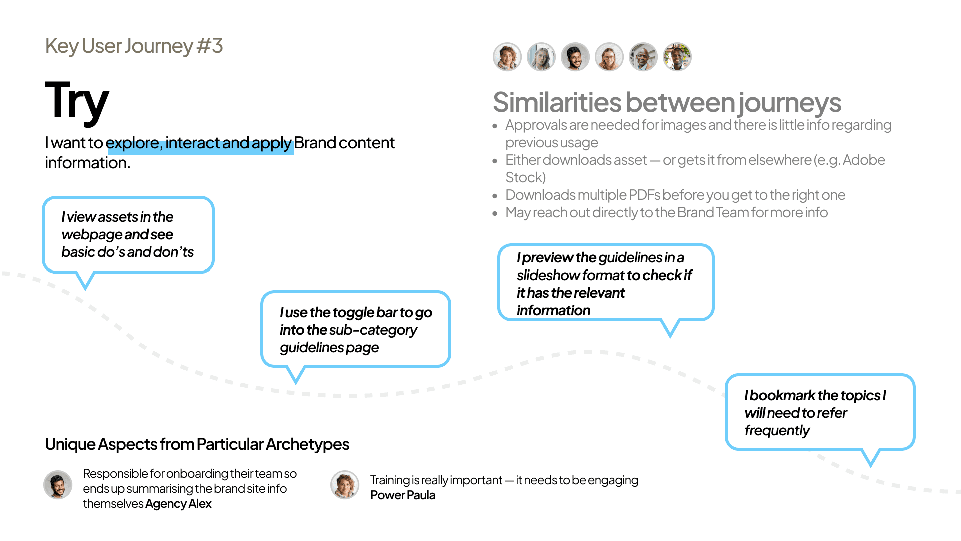
We defined 4 Key User Journeys which collectively form the complete Central Design Journey that helps to ensure a seamless and satisfying experience for every archetype.

All key user journeys collectively form the…
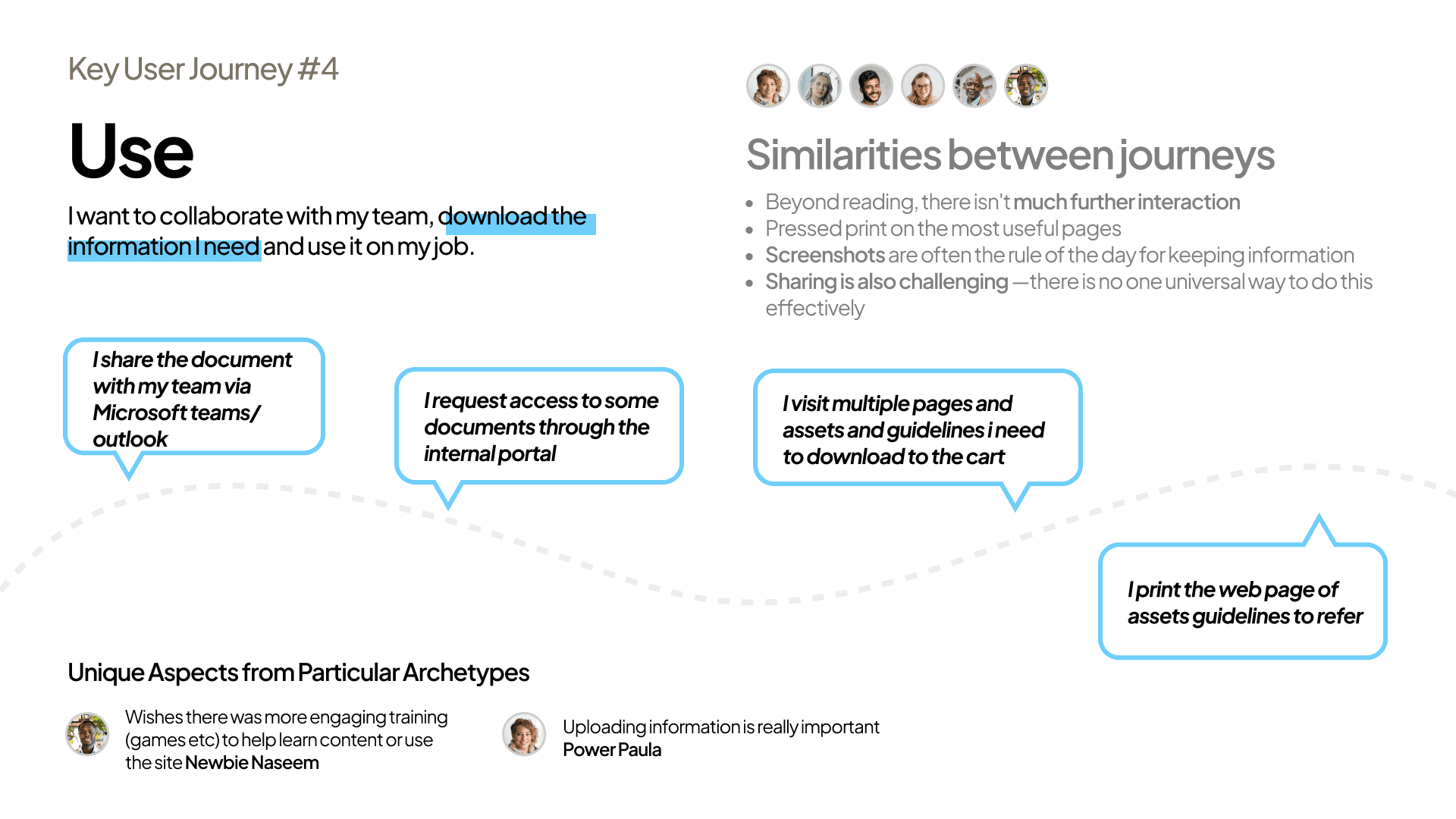
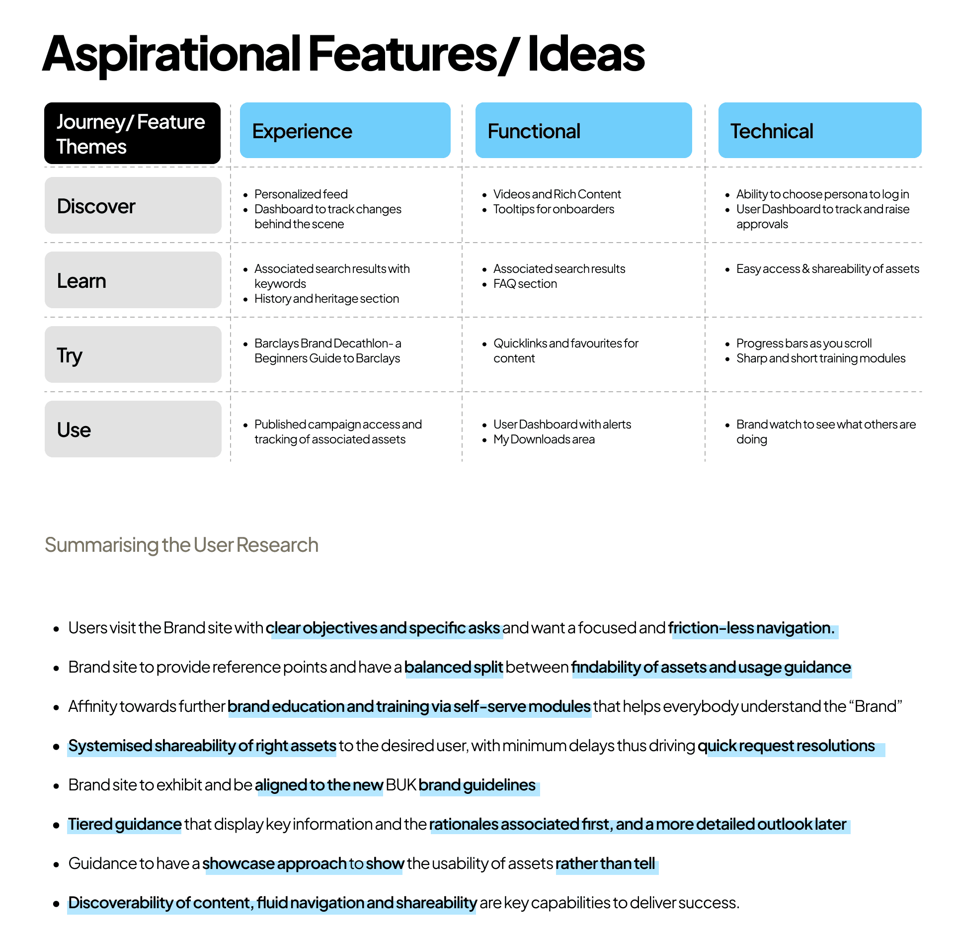
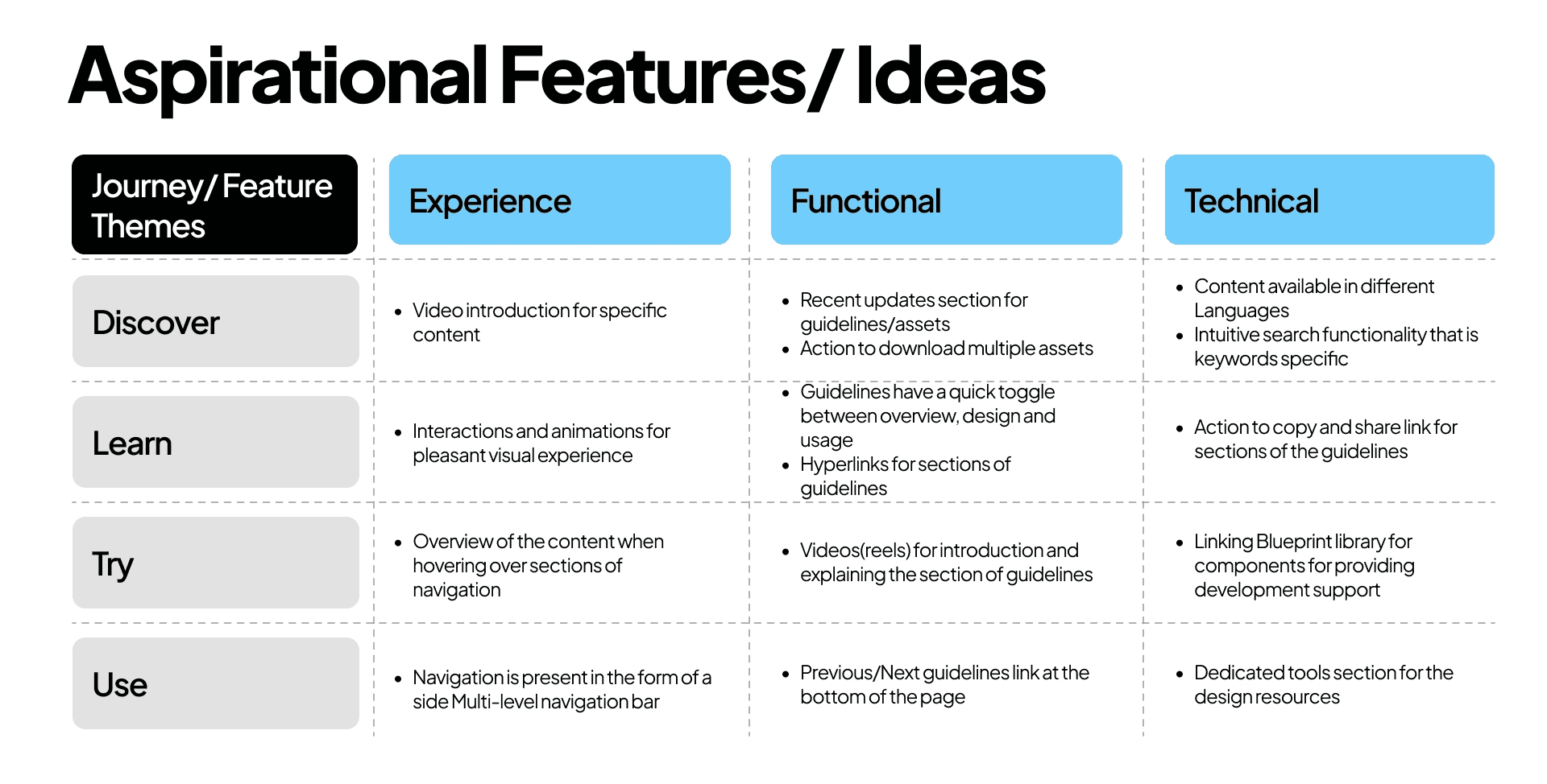
Key User journeys X User Feature Ideas helps us understand and make sense of all the ideas and valuable thoughts collected about the product at the User research stage. Here are the some of them-

We have identified what works and what doesn't for our users on the existing site. Additionally, we need to understand where the industry currently stands and what the best practices are. This will help shape our creative direction before we begin designing.

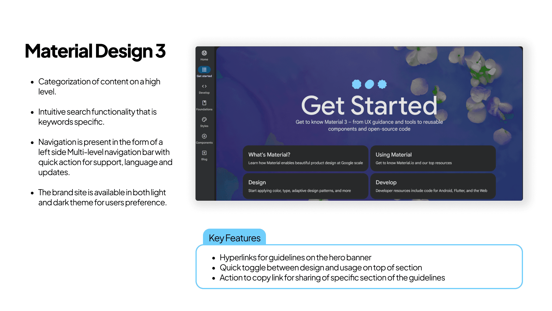


Key User journeys X Industry Study helps us understand and make sense of all the ideas and valuable thoughts collected about the product at the Best-in-class Benchmarking stage. Here are the some of them-


In today's connected world, users compare the experience of using the Brand Site to all digital experiences in the global marketplace.
Users now expect digital experiences to mimic natural behaviors, be familiar, be responsive and give them the exact information they require at the opportune moment.
In 2022, the baseline aspirations for consumers are:
Give me (some) control
Make it easy to find
Talk my language
Don't add unnecessary layers
Tailor to my needs
To successfully fulfill these aspirations, a prioritised set of functionality
is essential to deliver a product based on user goals and journeys.

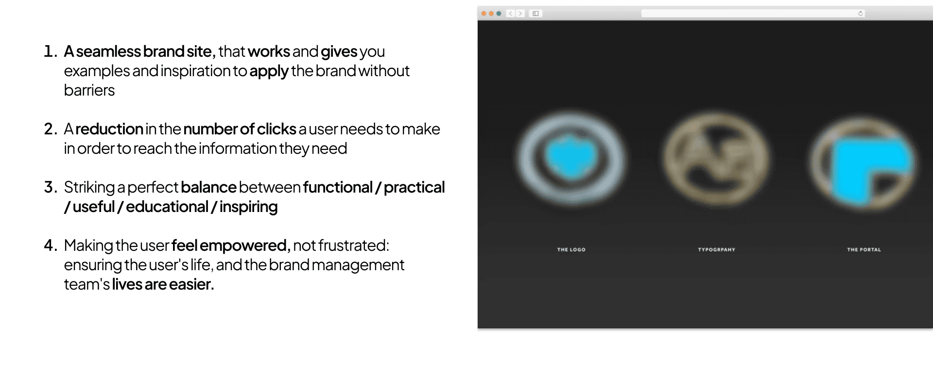
Defining Success
The priortised list streamlines and provides clarity to clearly define what success looks like for the Product to WIN!
Here is what success looks like-
Architecting the Site
An effective product can only be crafted through a logical and goal-driven information architecture (IA). Hence for this we understood that this IA should seamlessly guide through the key-user-journeys, meeting user needs at the most opportune moments to provide moments of delight. By ensuring this alignment, we ensured that the product shall achieve excellent user engagement.
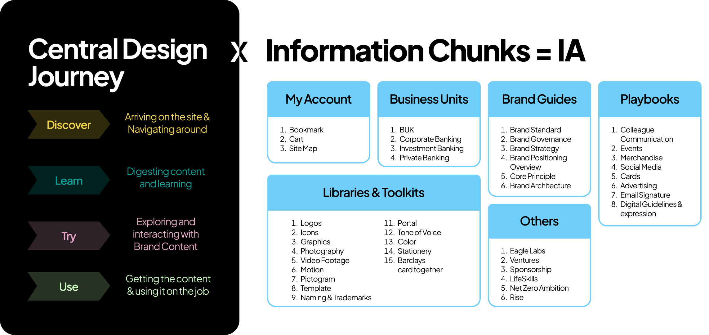
This exercise helped us to arrive on IA that is seamless and provides considerable reduction in the number of clicks.
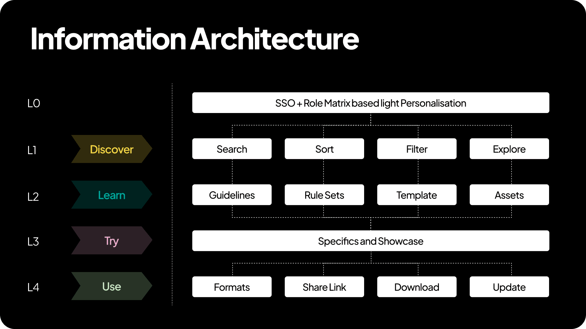
Understanding the Levels of the Information Architecture, from L0 to L4.

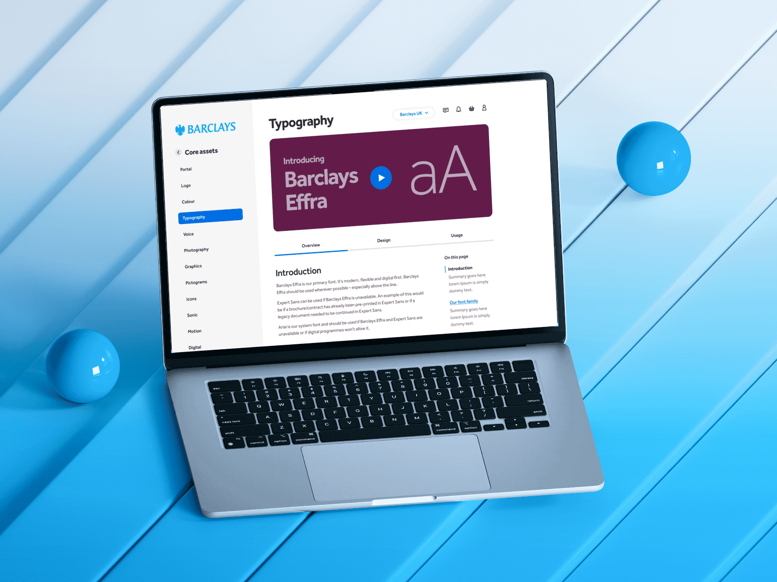
Once the information was designed, we realized that excellent user engagement also required well-designed content. With the help of the internal Barclays Brand team, we reviewed every Master Brand Guideline to ensure our design aligned with today's user goals.

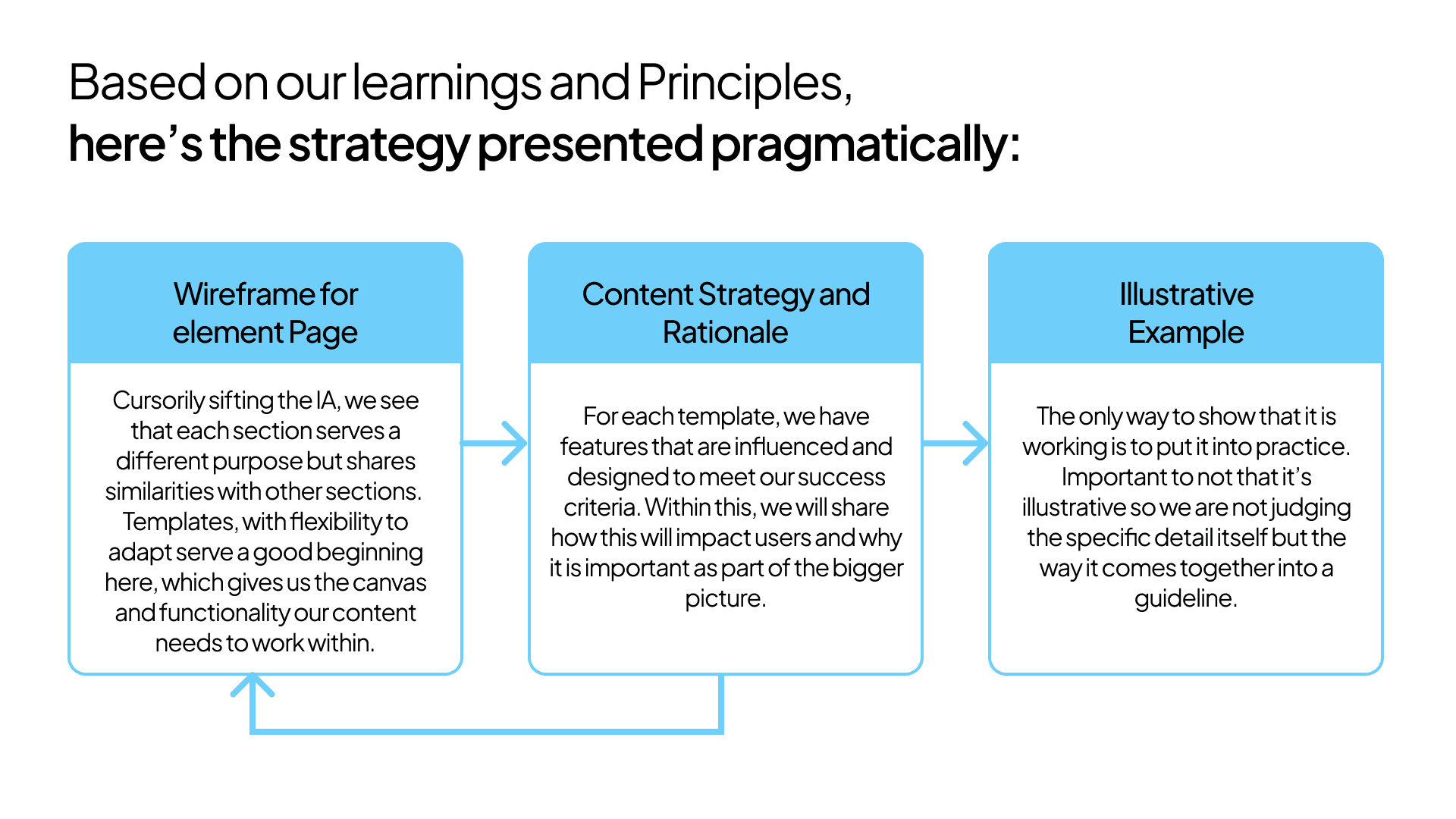
Implementing the Strategy- Early Designs
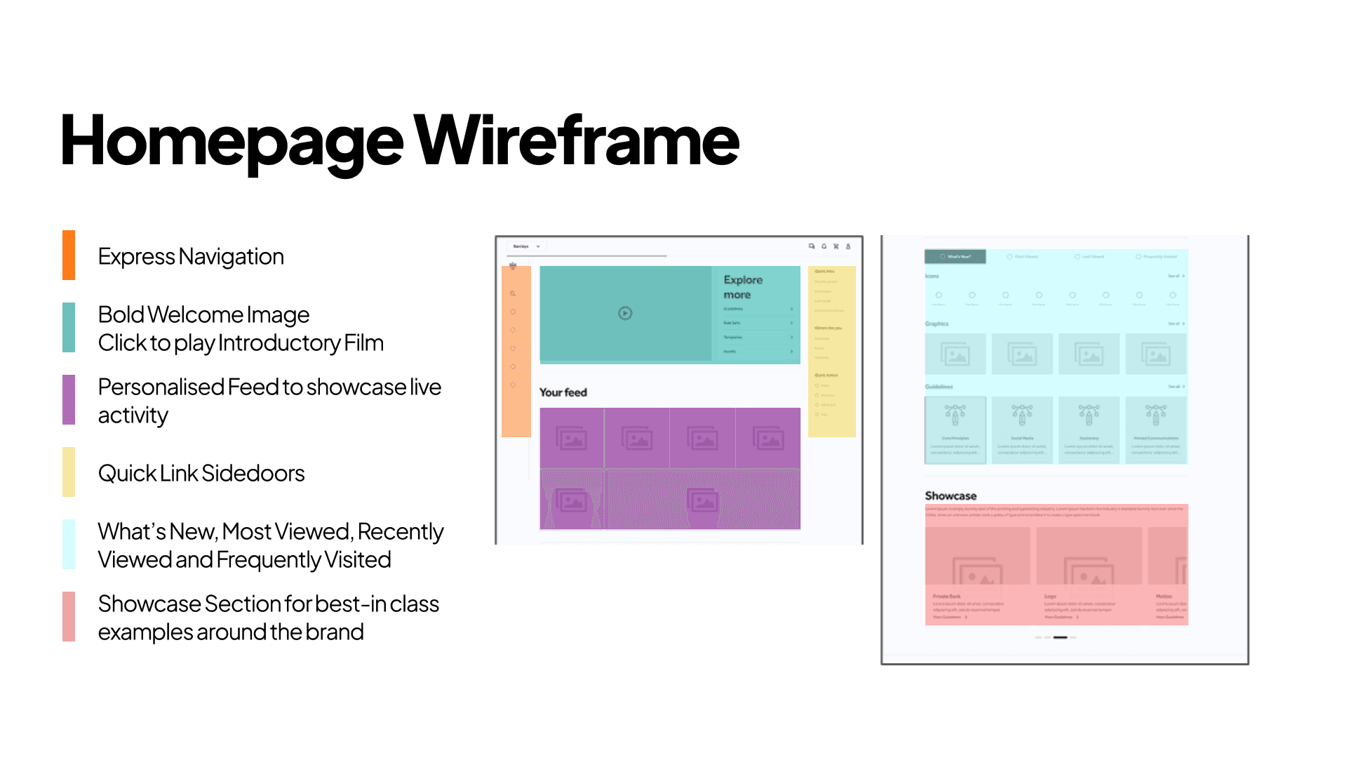

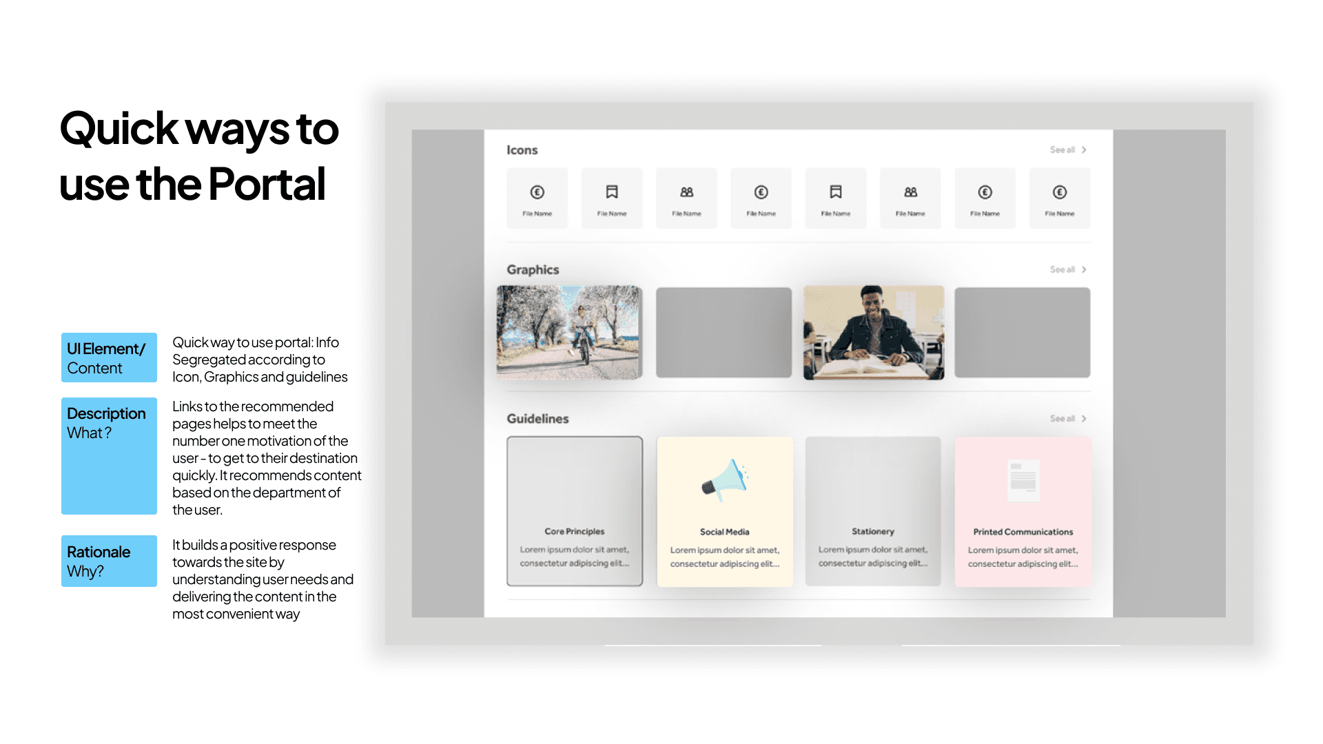
We also examined how each prioritised feature, ref the Master Prioritisation List, could be seamlessly incorporated into the design. This approach provided us with the maximum advantage to deliver a site that is on-brand, aligned with user goals, highly usable, and in line with industry trends.
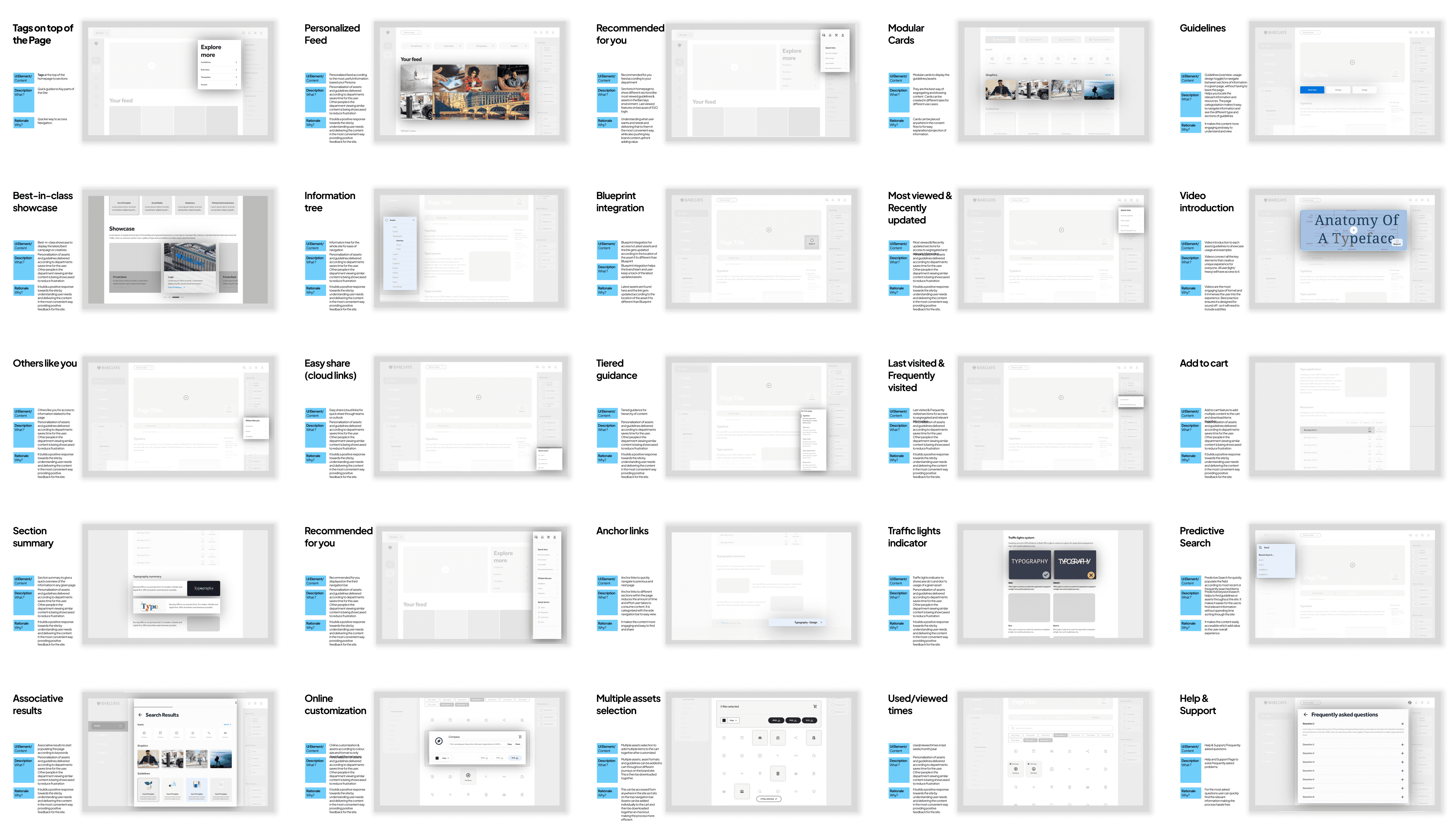
Here are the illustrative example of one Feature-
and 25 other Features…
The story so far…