Introduction
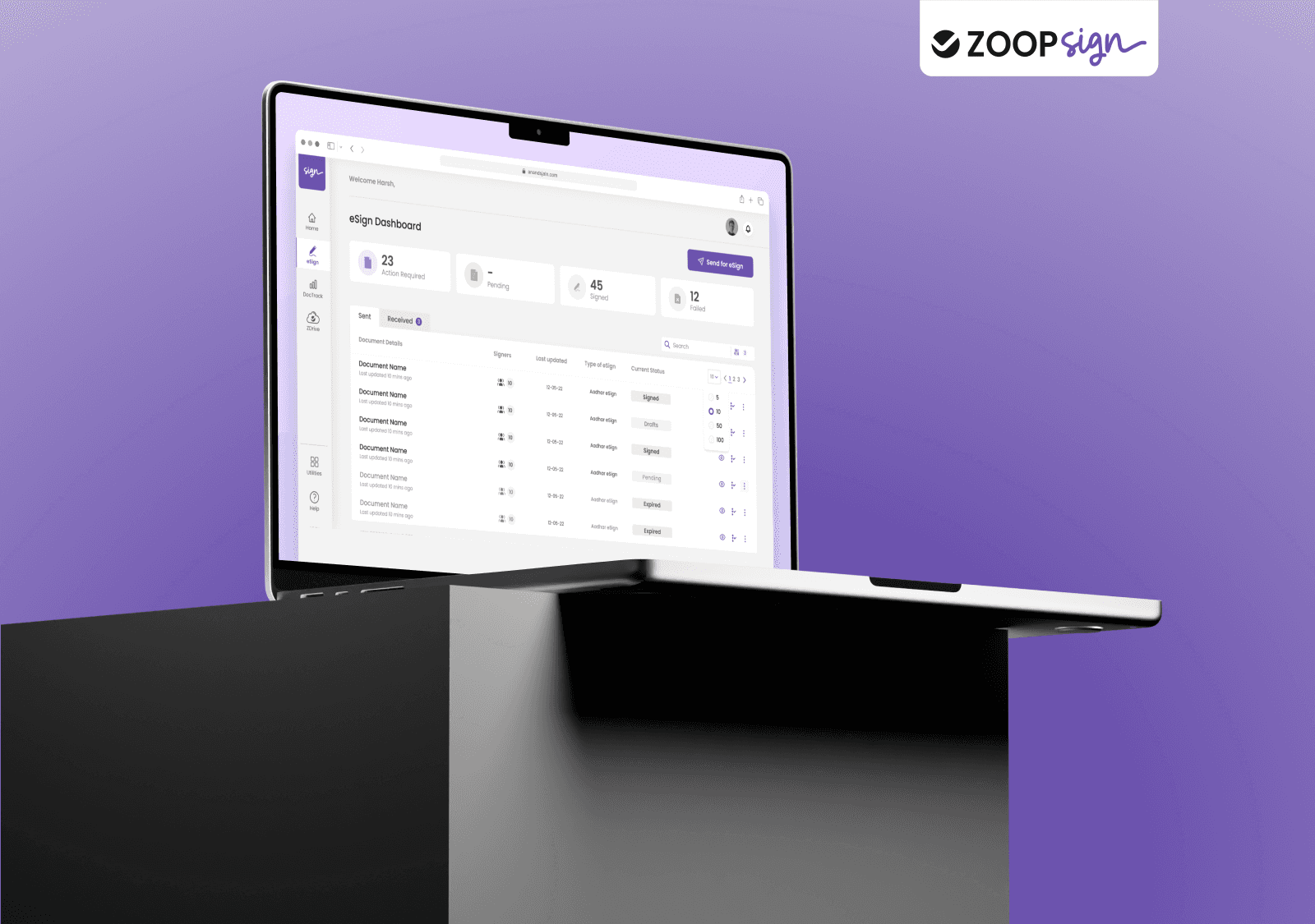
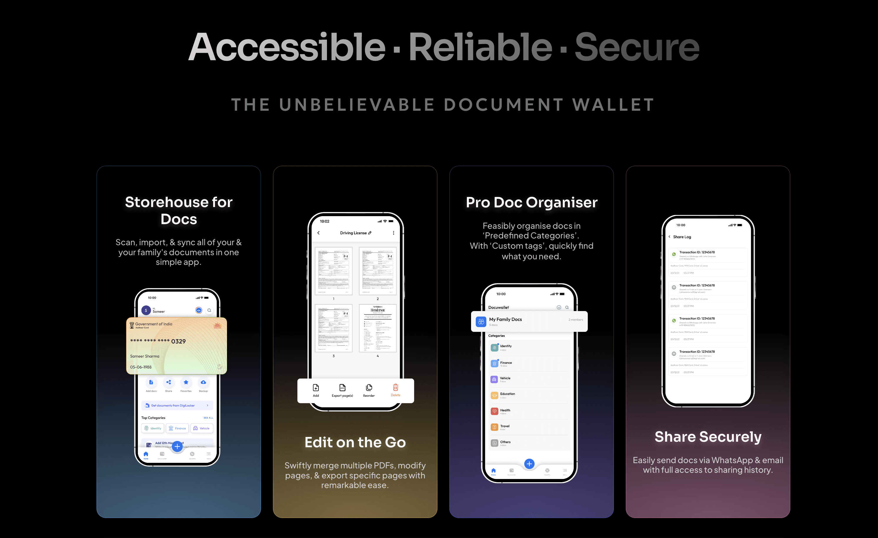
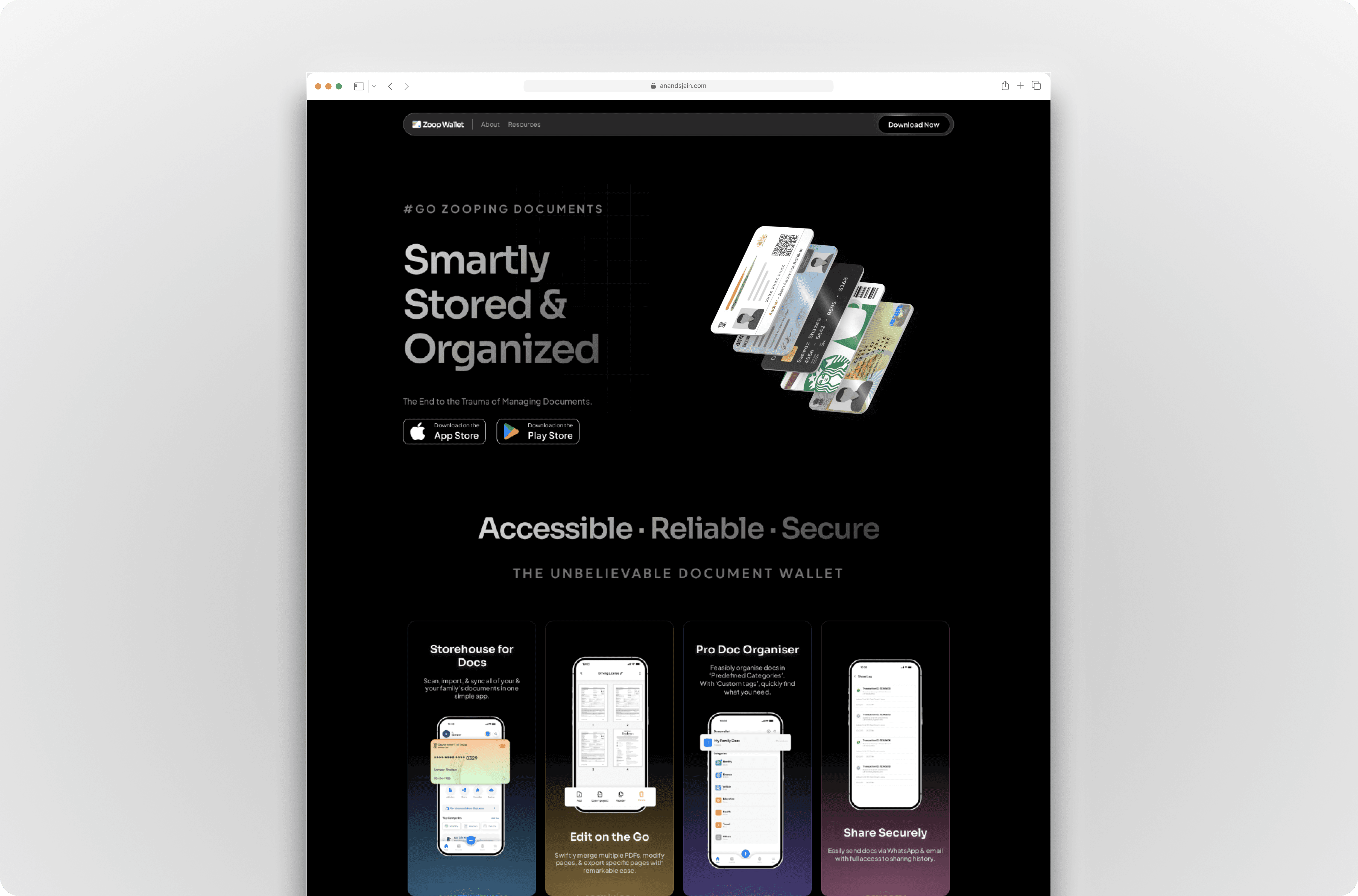
Zoop Wallet is Southeast Asia's fastest growing AI-powered digital document management app that allows users to scan, upload, and securely store important documents. It features AI-driven document scanning and integrates with DigiLocker to support intelligent categorization, enabling seamless access and sharing via WhatsApp and email. In the new landing page, we set out to solve the problems below within 1 month. The results were amazing.
My Role
I led the design, user testing and development of this project from end to end. I collaborated with 1 product designer (Khadija) during the early ideation stage and the lead business manager throughout the entire project.
Problem
Today, over 90% of our users are on the Zoop mobile app. Due to the low usage, we never prioritized improving on or building new features for the website.
The old landing page is outdated.
It has not gone through a redesign for 4 years. The design language is not consistent with the app. The old landing page shows Zoop Wallet features, visitors do not see other product offerings like deals, benefits and AI capabilities.
Zoop does not have an official company page.
Since the early days, Zoop has not set up a corporate page to communicate what our company is about, to our investors, merchants and consumers.
The existing app download metrics could be improved.
We want to drive more app downloads since our main product focus is on the app. In India, our consumers mostly use Zoop via the mobile web browser. We wish to convert web users to the app so they enjoy a better experience.
Goal
Communicate Zoop's value proposition
To give clearer messaging. Throughout the years, our products have scaled beyond just document scanning.
Drive app downloads
Today, over 90% of our users are on the Zoop mobile app, but we still maintain our web presence for the remaining 10% users. We want to convert users from web to app, so that they enjoy a better experience, and we could focus our resources on the app instead of maintaining several platforms.
Drive merchants to ZoopBiz
To attract potential merchants/business who wants to use ZoopBiz to grow their business and offer benefits to Zoop users.
Drive job seekers to Careers page
To entice potential candidates who would like to join the Zoop family.
Impact
Hooray, we launched the landing page on Feb 7, 2024! For confidentiality reasons I have omitted the actual values for these metrics.
The moment it went live, we immediately saw a 50% increase in downloads of our app from our landing page, compared to the old website. After 48 days of going live, we saw a 450% increase in app downloads.
Early Ideation
We kicked off a design sprint together with the lead Product Manager.Using Miro as a remote collaboration tool, we gathered inspiration of how other forward-thinking brands craft their landing page, and shared what we like about them.
Then, we did a quick solution sketching together to end the sprint. This mini design sprint was condensed into 2 hours as our schedule were packed.
On a separate session, we established 4 design principles for the landing page to make sure we design based on these principles. These principles are centered around our consumers—How consumers portray us as a brand.

We started sketching some crazy ideas on our minds. Our focus at this stage is to diverge first, converge later.

This is how the early wireframes looked like. On the right, we mapped out the purpose of each section, aligning with our design principles. The primary goal is to convince users to download the app.
We then turn these early ideas into high fidelity designs. We experimented with different colors, shapes, layouts. But it felt all over the place, so we continued to refine these designs.

Here's the outcome after several iterations, though this is not the final design. We needed a design that is solid enough to kickstart the user test, so we can learn what people really think about the landing page. We fail fast, in order to learn faster.
User Testing
I conducted user tests with 5 people outside Zoop using Maze's Survey tool.To avoid bias, I changed the brand to 'Plus', swapped the brand color to Pink-Blue, and tweaked the copy so responses are more accurate.This is what the survey looks like. It's easily shareable via a link.

I consolidated the test results on Notion. A heatmap is also generated to help us understand how people interact with the landing page.
Here are the results!
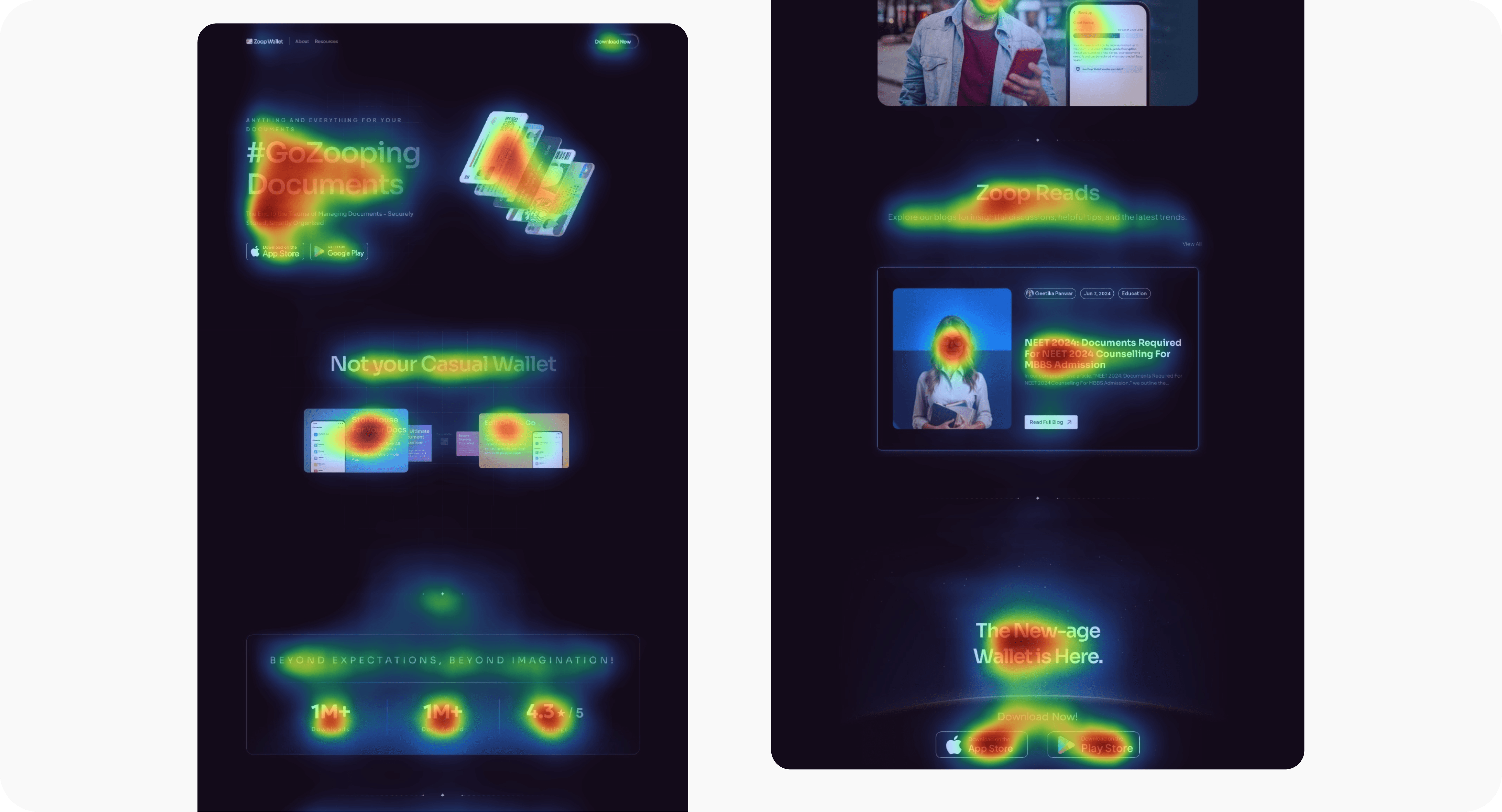
From the heatmap, we found that 20% of users scroll to the bottom. We were worried people won't notice some clickable elements, but the heatmap results proved otherwise.
By asking specific questions in the survey without revealing that we are Zoop, we found that people were able to understand what the product is about.In India, there are many e-wallets so people tend to consider Zoop as one too, but we aren't.
So in this landing page, we tell people that we don't store users' money. We also educate users to securely store, manage and leverage on Zoop's full AI potential to unlock greater convenience for them.
And then, back to the artboard. I continued to iterate the designs to strengthen our value propositions and ensure all messaging are clear as crystal, while driving app downloads.
Final Designs
Before and after
Before the redesign, there was lack of focus on what Zoop offers. The website was cluttered. The design language was inconsistent with the Zoop app. It does not do justice to Zoop's unique value proposition.Here's a detailed walkthrough of what I improved post-testing.